As the Harvard Library web team works to redesign its digital home, we're evaluating what content we want to share with users by applying a rigorous and thoughtful page design process.
Our process involves four stages:
- Content strategy
- Sketching and wireframing
- Visual design
- Coding
To illustrate the approach, I’ll recount how we designed event pages, coming soon to a beta library site near you. Grab yourself a cup of tea, because we have much to cover.
Stage 1: Content Strategy
Apart from understanding what we’re designing, we need to know why we’re designing it. That’s where content strategy comes in.
Critical questions we ask at this stage include:
- What is the purpose of the page, and who is it for?
- What is its value proposition? In other words, as a user visiting this page, what’s in it for you? And what kinds of things need to be on the page to confirm that notion?
- What should a user be able to do on this page for us to consider it successful?
Applying this exercise to the event pages, we determine that:
- The goal of the page is to inspire event attendance.
- The primary audience for the page are students and users with a passing familiarity of the library. We expect experienced users to engage with library activities in other ways, but this page will still meet their needs.
- The page should includes images, speaker details, and other event information to convince users the event is worth attending and explain what they will learn or gain from the event.
- The page is achieving its goal when we observe users are registering for events or clicking on other related information pulled into the page.
Examining why this page needs to exist and how users will interact with it guides how we prioritize content on the page and later informs how we design the page.
Stage 2: Sketching and Wireframing
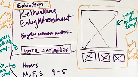
Informed not just by the page’s goal but the exploration of ideas that got us there, things get even more interesting, because now we doodle. We doodle with purpose, that is, tackling the question: “How do we arrange everything that needs to be on this page?”

Whether on a whiteboard or a napkin, we begin drawing simple shapes and lines that represent various page elements.
Part of the process includes drawing inspiration from other sites with similar pages. Before long we visualize a set of ideas we think will serve our needs.
For example, we know a user of this event page will want to know about the event’s time and place right away, so we sketch that on our page with a size and orientation that conveys the importance we've placed on that content.
Although sketching starts as a solo exercise, we reconvene as a team to share our sketches and as a group arrive at a composite of our best ideas. This composite is then turned into a wireframe, or a formalized illustration of the sketch. The wireframe remains unstyled, preserving the simplistic line-and-shape nature of our original sketches.
At this point we can test the effectiveness of the page with users. Testing at this stage lets us know whether we’re on the right track.
Stage 3: Visual Design
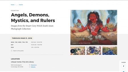
This is the stage people most often recognize and associate with page design. Using a graphic design application, we begin to mock up with greater detail the look and feel of elements laid out in the page wireframe.

As part of this project, we’re also engineering a holistic system of colors, fonts, styles, and layout and interface patterns referred to as atomic design. Applying the qualities of our atomic system to a wireframe lets us see our sketches translated to high-fidelity representations of future web pages.
For example, we’ve already determined the style and layout for an event’s date and time earlier in the project. The visual design relies on the design system to render those elements consistently.
Because the mock-up is so close to how the actual page will look and feel, the visual design stage affords the team one more checkpoint to determine they’ve created a page that serves the right purpose. It’s still relatively easy at this point to turn the ship around for a bit and reimagine elements that aren’t generating the confidence the team requires for sign off.
Stage 4: Coding
Coding is where the ambitious dreams of the team meet the practical reality of the web — when the components of the page we’ve conceived get converted to their technical components.
Visual styles are translated into CSS; page behaviors are turned into JavaScript; and markup to present it all gets converted to HTML. This may all sound daunting, but if we’ve done everything in the preceding stages right, our developers will know exactly what to do with no surprises.
During the coding stage many more conditions are now testable, such as: the usability of the page when viewed through a mobile display, the accessibility of content on the page to users with disabilities relying on assistive page-reading devices, and discrepancies between competing browser standards.
This stage also represents the culmination of our atomic design approach, as the code is added to our instance of Pattern Lab — a repository where we can break page layouts and interfaces down into smaller parts while ensuring those parts come together to form a beautiful and functional whole.
To the uninitiated, the process of page design can come across as long and exhausting. Once you and your team are engaged, however, it can be some of the most invigorating and intellectually stimulating work any information professional can hope to tackle.
Doing it right, we ensure the sum of our efforts leads to a website that’s creatively designed, intuitive to use, and endlessly helpful.