Overview
The campus library has always been at the heart of university life. For Harvard, the Library is core to its mission — ensuring Harvard’s leadership of education and inquiry in the pursuit of enduring truth.
Here at Harvard Library, we connect students, faculty, and scholars with vast, useful resources to make their research richer, learning fun, and discovery delightful.
These brand guidelines, together with our writing guide, are tools for library staff to use and share our work. We welcome you to explore, discover, and ask questions.
You can always reach us at harvard_library@harvard.edu.

Brand Strategy
Establish a Culture of Use
A key initiative in our brand strategy is to establish a culture of use. To do this, we put the users at the center of everything we do so they can help shape how we evolve.
We want our users to understand that Harvard's libraries are not only centers for knowledge, but are sanctuaries for learning, collaborating, and discovering new ideas—and that everyone can tap into this shared knowledge. We develop and promote tools and resources that are accessible to all. We want every one who interacts with us to know they can take full advantage of our services. We strive to deliver a streamlined, useful, and cohesive experience—both in person and online.
We invite you to be part of the journey. We hope that by illuminating our process—the scaffolding that supports all of the different ways you use the library—we continuously evolve and improve together.
Useful
We strive to have what our users need, when they need it. The information and resources we share should be clear, easy to understand, and meaningful to each person.
Helpful
Our goal is to meet users where they are in their learning process, regardless of how they find us. Whether users interact with the library digitally or face-to-face, we want to set them up for success in their work.
Accessible
We believe that users should easily be able to find—and use—all of our resources.
Open
We strive to be transparent and share what we have as widely as possible, whenever we can.
Color
Harvard Library’s palette of blue, red, and yellow are pops of primary color that draw your eye to important calls to action—like the experience of browsing for a book in our stacks. Our goal is to embrace Harvard’s signature crimson while introducing bright hues and bold accents. We hope to reflect the fresh energy of the library, as the traditional and the modern work together.
Relationship
The base color of this site is white, bolstered by black, gray and blue, for optimal readability and a pleasing visual experience. The primary colors are intentionally bright to draw the eye to areas of importance, utility and action, and are often associated with pages geared towards specific audiences. Supporting colors and gradients in concert with the primary colors create aesthetic balance and offer room for creative expression of the brand.
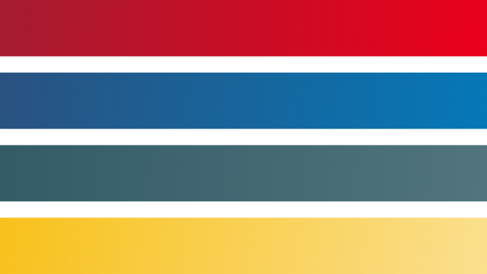
Primary Colors
These are the colors that make up Harvard Library’s website. The primary color palette includes bright, vibrant colors to represent our dynamic library, while the Harvard crimson and a slate blue are used to illustrate the traditions of our iconic brand.
HEX: #0579B8
RGB: 5, 121, 184
Use this color for links, buttons, and as an accent element for content geared towards students at Harvard.
HEX: #EB001B
RGB: 235, 0, 27
Pair this color in a gradient with Crimson to brighten decorative background elements.
HEX: #A51C30
RGB: 165, 28, 48
Harvard’s signature color. Use in
areas that call for a more familiar Harvard feel.
HEX: #3E6F7D
RGB: 62, 111, 125
Use this muted hue to represent Harvard Library’s collections across the site.
HEX: #F8C21C
RGB: 248, 194, 28
Use this bright accent color to call attention to dates, hours, services
and tools.
Supporting Colors, Gradients, and Patterns
To support the design aesthetic, we introduced the colors and gradients below. Use these as directed.
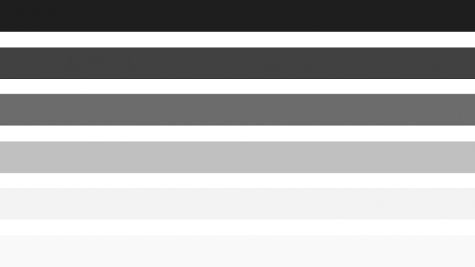
Grays
#1E1E1E, #414141, #6C6C6C, #C0C0C0, #F3F3F3, #F9F9F9
#1E1E1E — Use for headings and prominent text
#414141 — Use for most body copy
#6C6C6C — Use for subtle text and some icons
#C0C0C0 — Use for dividers and borders
#F3F3F3 and #F9F9F9 — Use for background shading
Gradients
Crimson to Cambridge Red (#A51C30 → #EB001B) — Use the Crimson to Cambridge Red gradient for some icons and as a background on filters and subnavigation.
Dark Blue to Breakthrough Blue (#2A5280 → #0579B8) — Use as a color wash over hero images for "How To" pages and as a background on filters for pages geared toward Harvard students.
Bookmark Blue to Light Bookmark Blue (#3E6F7D → #52757E) — Use as a background on any filters and blocks related to Harvard Library collections.
Brilliant Yellow to Light Yellow (#F8C21C → #FBE08E) — Use as a background on filters for services and tools.
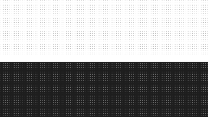
Patterns
Use these patterns to add texture and dimension to backgrounds on some components and calls-to-action. Use discretion when applying patterns so as not to distract, overwhelm, or impact readability.
Typography
Harvard Library’s typographic language is made up with two typefaces — Trueno and Lora. We selected these fonts not only because they are clean and legible, but also because they are open source which supports one of our guiding principles.
Trueno
Trueno is the primary typeface used on Harvard Library’s website. It originated from Montserrat and therefore has a similar look and feel. Trueno is used for primary headers, navigation, links, buttons, and callout text. Download it.
Trueno Bold
A B C D E F G H I J K L M N O P Q R S T U V W X Y Z
abcdefghijklmnopqrstuvwxyz1234567890
Trueno Semibold
A B C D E F G H I J K L M N O P Q R S T U V W X Y Z
abcdefghijklmnopqrstuvwxyz1234567890
Trueno Regular
A B C D E F G H I J K L M N O P Q R S T U V W X Y Z
abcdefghijklmnopqrstuvwxyz1234567890
Trueno Light
A B C D E F G H I J K L M N O P Q R S T U V W X Y Z
abcdefghijklmnopqrstuvwxyz1234567890
Trueno Ultralight
A B C D E F G H I J K L M N O P Q R S T U V W X Y Z
abcdefghijklmnopqrstuvwxyz1234567890
Lora
Lora is the secondary typeface used on Harvard Library’s website. It is a well-balanced contemporary serif with roots in calligraphy. It is a text typeface with moderate contrast well suited for body text. Lora is used for body text, subtitles, and quotes. Download it.
Lora Regular
A B C D E F G H I J K L M N O P Q R S T U V W X Y Z
abcdefghijklmnopqrstuvwxyz1234567890
Lora Italic
A B C D E F G H I J K L M N O P Q R S T U V W X Y Z
abcdefghijklmnopqrstuvwxyz1234567890
Lora Bold
A B C D E F G H I J K L M N O P Q R S T U V W X Y Z
abcdefghijklmnopqrstuvwxyz1234567890
Lora Bold Italic
A B C D E F G H I J K L M N O P Q R S T U V W X Y Z
abcdefghijklmnopqrstuvwxyz1234567890
Font Styles
H1 Header Text | Desktop: Trueno Bold, #1E1E1E, 60px, line-height 74px Mobile: 32px, line-height 40px |
H2 Header Text | Desktop: Trueno Bold, #1E1E1E, 32px, line-height 42px, uppercase, letter-spacing: 2.4px Mobile: 24px, line-height 31px |
H3 Header Text | Desktop & Mobile: Trueno Bold, #1E1E1E, 20px, line-height 30px, uppercase, letter-spacing: 1.5px |
H4 Header Text | Desktop & Mobile: Trueno SemiBold, #1E1E1E, 20px, line-height 30px, uppercase, letter-spacing: 2.14px |
H5 Header Text | Desktop & Mobile: Trueno SemiBold, #1E1E1E, 19px, line-height 29px |
H6 Header Text | Desktop & Mobile: Trueno SemiBold, #1E1E1E, 16px, line-height 28px |
Subtitle Text | Desktop: Lora Italic, #1E1E1E, 26px, line-height 40px Mobile: 22px, line-height 34px |
Supporting large text | Desktop: Trueno Light, #1E1E1E, 25px, line-height 42px Mobile: 22px, line-height 38px |
Paragraph text. Lorem ipsum dolor sit amet, consectetur adipiscing elit. Sed dui nisi, congue sit amet mauris non, placerat tincidunt mauris. Maecenas sit amet nulla non sem rutrum tincidunt eget eget magna. Curabitur gravida blandit semper. | Desktop: Lora Regular, #414141, 19px, line-height 32px Mobile: 17px, line-height 29px |
Small paragraph text. Lorem ipsum dolor sit amet, consectetur adipiscing elit. Sed dui nisi, congue sit amet mauris non, placerat tincidunt mauris. Maecenas sit amet nulla non sem rutrum tincidunt eget eget magna. Curabitur gravida blandit semper. | Desktop & Mobile: Lora Regular, #414141, 15px, line-height 26px |
Iconography
A thoughtful iconography system adds visual context and helps guide users successfully through a web experience. Iconography can be helpful to aid audiences who speak different languages, as the right icon can convey an idea in seconds and transcends language barriers.
We use the Google Material Icon Set as much as possible on the Harvard Library website. In cases where we need a specific icon that isn’t available by that set, we source icons from The Noun Project, or create a custom icon.
Photography
Harvard Library uses several different types of photography. Here are some guidelines around how to select photos for each.
Background Images
Background images provide visual interest, segment vertical sections of the website from others, and generally prevent the website from being a big, hard-to-read wall of text. They appear in many places on the Harvard Library website, including some page headers, featured content, full-width call-to-action components, and Harvard Library collections.
For hero background photos, use images without a central focal point (e.g. photos of scenery, landscapes, skylines, buildings, crowds), so text overlays aren’t difficult to read and they don’t distract users. Only use full-color images (i.e. no black-and-white, no sepia-tone, no filters). The recommended width is 1600px.
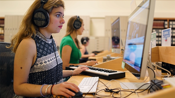
In-Context Images
In-context images are used to help support surrounding information on the page with visual context. Don’t add them unless they are relevant and improve the content. Extraneous imagery is distracting and can even confuse users.
Photos of People
Photos of people should be candid and feel authentic. Avoid using posed photos or photos where people are looking directly into the camera, as these feel staged.
Crediting Images
Include credits with the image if it is being sourced (with permission).
Portrait Images
Portraits of staff are used on certain pages, such as the staff directory. The recommended aspect ratio for portraits is 1:1. Always use a well-lit portrait with the subject’s face in the center of the image and nothing distracting in the background. Avoid using selfies!
General Guidelines and Sourcing
Here are some tips to follow when selecting and using imagery for the Harvard Library website:
- Never use clip art.
- Use large enough images so they appear sharp — not pixelated — at every breakpoint and on all devices.
- Recommended file types are .jpgs and .pngs. Avoid .tifs and .gifs.
- Make sure to follow proper accessibility guidelines for photography.
- Stock imagery should be used sparingly. Try not to use it at all, but if needed www.pixabay.com and www.pexels.com are good resources for royalty-free photos that are free to use.
Grid System
The desktop grid for the Harvard Library website is made up of 12 columns and is 1410px wide.
Pages can contain a number of layouts, as shown below. On smaller breakpoints, content begins to stack. At mobile sizes, all content is stacked and has a 20px gutter on the left and right side, with the exception of full-width bleed components, which touch the left and right edge.
Note that this is just a guide. Some components within our design system are edge cases and do not fit perfectly into the columns within the grid. See the grid in action on our Pattern Lab environment.
Accessibility
Harvard Library must comply with the WCAG-AA web-standard. For design purposes, the following must be met at a minimum, though there may be other applicable guidelines.
Contrast
Here are some tips to follow when selecting and using imagery for the Harvard Library website:
- For font sizes under 18 point (or 14 points if bold) contrast must be a minimum of 4.5:1
- For font sizes greater than 18 points (or 14 points if bold) contrast must be a minimum of 3:1
Images and Other Non-Text Content
Here are some tips to follow when selecting and using imagery for the Harvard Library website:
- All non-text content must have a text alternative on the page that displays the same information, for example:
- Include alt tags or aria labels on all images that must describe what is happening within the image
- In the event an image is purely decorative in nature, the alt tag must be present but should be left blank
- Note that items such as stock photography or landscapes are not considered purely decorative and must have the appropriate descriptors
- Include transcriptions of video or closed captioning
ICONOGRAPHY
Note that iconography is a special type of image content.
- Current guidelines display all icons with a label underneath them
- If this guideline is followed then the alt tag should be left empty (but it should still exist)
- If the label is removed then an alt tag with proper information must be applied
Color
Color cannot be the only means of displaying information. Additional items such as a label, higher contrast or another visual cue must be used.
Links
Here are some tips to follow when selecting and using links on the Harvard Library website:
- The purpose of a link can be determined from the link text alone or or from the text combined with programmatically determined content
- The largest errors usually found here are on article preview links or similar instances where there may be multiple links on a page stating “read more” or other similar repeatable text. This should be avoided.
- Additionally links that are not links but items such as files, e-mail to links and phone numbers should be clearly labeled as such
- More about creating helpful hyperlinks can be found in the Harvard Library writing guide
Rich Text Editors
- These should be used sparingly across the site. Rich text editors have the potential to easily break 508c compliance as many of the programmatic failsafes that exist will not happen within a rich text editor
- If a rich text editor is used, the content author needs to be sure to follow good programming guidelines if using HTML (such as semantic markup and using appropriate labels)
- Additional focus also needs to be taken on headings, labels and other items to guarantee an adherence to the page's navigability
Headings
Headings must be hierarchical and properly nested (all h2’s within an h1, etc.) so as to maintain proper navigability for low or non-sighted users.
Tables
The current tables as defined in components are accessible. However, these tables must be used appropriately in order to remain so. The following rules must be adhered to:
- Only use tables for tabular data (don’t use tables for styling purposes)
- All labels within a table must be next to the data they are labeling (the current examples adhere to this pattern)
Accessibility Checkers
Note that the following accessibility checkers will only catch programmatic issues such as missing alt tags or improper contrast ratios. Many accessibility errors can only be caught by humans and hence online checkers should only be one part of the confirmation process.
Resources and Guidelines
Generally speaking, the rules above do not encompass the entirety of all accessibility considerations on the site and additional information may be necessary. Further resources can be found here:
- WCAG Quick Reference
- Entirety of the WCAG 2.0 Guidelines
- WebAIM which is an independent company with good information